Typography plays a crucial role in the design of our brand identity. The typography in our logo can be as impactful as the graphic elements. As with imagery, typography can suggest an alternate meaning or cultural context for a brand’s identity.
- Creative Approach
We encourage typographic creativity for print use cases.
These type settings combine Willamette’s heritage branding with a bold sans serif for a modern twist. Evoking an intellectual aesthetic suitable for a premier university, the typography also offers visual texture that speaks to innovation.
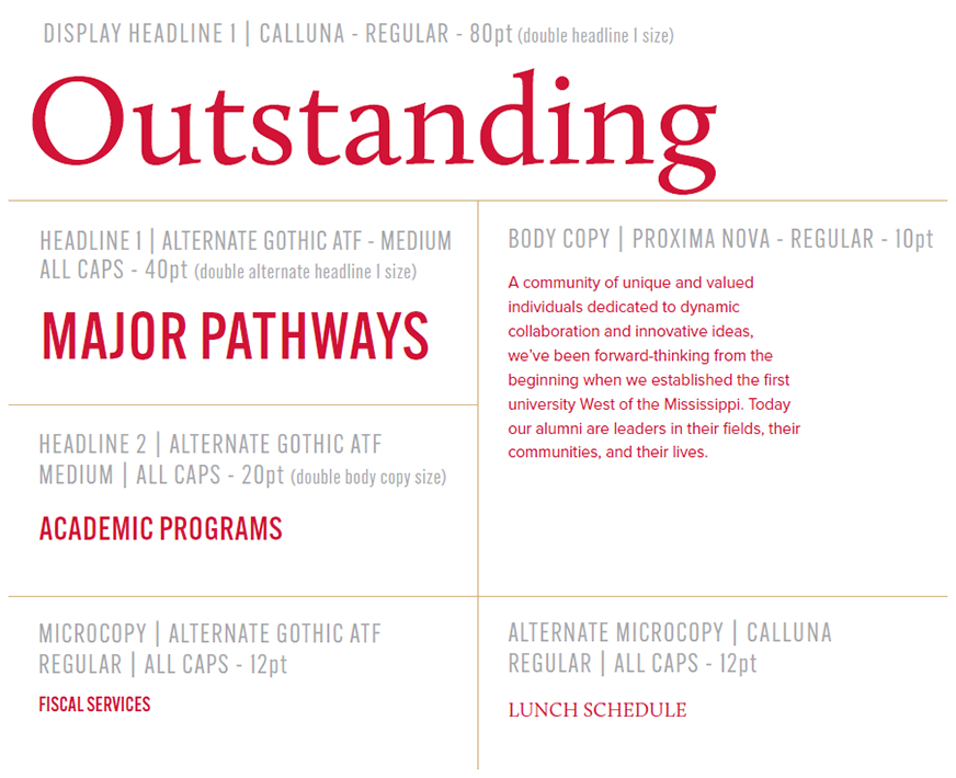
We lead with Calluna, chunky and assertive, with exaggerated serifs. The precise lines of this serif make it a modern alternative to other old-style types. Calluna combines the charm of classic design with the cleancut appeal of modernism.
For a twist we add Alternate Gothic, a gothic sans-serif typeface designed by Morris Fuller Benton in 1903 and released through American Type Founders. It was created as a condensed version of Benton’s Franklin Gothic.

Display Headline | Calluna - Regular

Display Headline 2 | Alternative Gothic ATF - Medium

Headline 1 | Alternate Gothic ATF - Medium

Headline 2 | Alternate Gothic ATF - Medium

Headline 3 | Alternate Gothic ATF - Medium

Body Copy | Proxima Nova - Regular - Typography for PNCA Units
We encourage typographic creativity in print and digital mediums.
We lead with Din Next LT Pro, a modern adaptation of the German-designed Din, originally created for signage and industrial applications. Uncomplicated and unadorned, it stands in contrast to the myriad visual styles of art generated at PNCA.
Body copy can be set in Din Next LT Light or Proxima Nova depending on legibility needs.

DISPLAY HEADLINE 1 | DIN NEXT LT PRO - BOLD CONDENSED - ALL CAPS

SUBHEAD 1 | DIN NEXT LT PRO - LIGHT CONDENSED - ALL CAPS

SUBHEAD 2 | DIN NEXT LT PRO - BOLD CONDENSED - ALL CAPS

SUBHEAD 3 | DIN NEXT LT PRO - BOLD

BODY COPY 1 | DIN NEXT LT PRO - LIGHT

BODY COPY 2 | PROXIMA NOVA - REGULAR - View Type Hierarchy Examples
Type ratios encourage uniform messaging across multiple applications.
The point size examples given here were formulated for an 8.5” x 11” letterhead. These sizes are not concrete, but instead an example of ideal type hierarchy. Aim to keep these proportions relative to each other no matter the size of the application, and scale up with consistency.


